Bug 856239
|
Description
Marcus Moeller
2012-09-11 14:24:18 UTC
Created attachment 611793 [details]
Font Rendering in Fedora 17 / Firefox
Created attachment 611794 [details]
Fuzzy Font Rendering in Fedora 18 / Firefox
https://fedoraproject.org/wiki/Talk:Features/FontconfigEnableAutohinting This nonsensical "feature" causes this regression, sending us back to the stone age of font rendering. Please drop the nonsense! (as pointed out by me on the talk page back on July 24, explaining very clearly what the "feature" would entail, but as usual nobody listened to me) I have read your comments on that 'feature' and fully agree. @Akira could we please revert it to the state in Fedora 17? I'm as confused about what this "feature" really *is*. We've have had autohinter for 10 years.... The "feature" forces autohinting, i.e. DISABLES THE BCI, by default for all fonts. :-/ that feature has been deferred as its category is now FeaturePageIncomplete. there are nothing I can revert in fontconfig at all. So when it's not caused by autohinting, do you have any idea why the rendering is so fuzzy in Fedora 18? I guess it's Liberation Mono. reassigning. I have downgraded the Liberation fonts to 1.07.2 which solves the problem. So it might have been introduced by this change: - Added conf files with 59 priority Nope, conf files are still with 62 priority. While testing i am seeing due to #842568 patch in Liberation Mono giving some fuzzyness. I am removing that patch. But font used in your screen shot is not mono. Thanks. Yes it is not mono. That has been assumed by Akira. (In reply to comment #12) > Nope, conf files are still with 62 priority. my bad, font conf are with 59 priority and that is intentional, Dejavu has higher 57 priority for selection. In F18 fc-match giving me Dejavu for :lang=en liberation-fonts-2.00.0-2.fc18 has been submitted as an update for Fedora 18. https://admin.fedoraproject.org/updates/liberation-fonts-2.00.0-2.fc18 (In reply to comment #11) > I have downgraded the Liberation fonts to 1.07.2 which solves the problem. > So it might have been introduced by this change: > > - Added conf files with 59 priority I have just removed auto-hint rules written for Liberation Mono and added 30-0 conf files for alias with Times New Roman and others. please let me know if any improvement. Package liberation-fonts-2.00.0-2.fc18: * should fix your issue, * was pushed to the Fedora 18 testing repository, * should be available at your local mirror within two days. Update it with: # su -c 'yum update --enablerepo=updates-testing liberation-fonts-2.00.0-2.fc18' as soon as you are able to. Please go to the following url: https://admin.fedoraproject.org/updates/FEDORA-2012-13863/liberation-fonts-2.00.0-2.fc18 then log in and leave karma (feedback). Sadly the package update did not solve the problem. Fonts sill look fuzzy. Hmmm, what changed? Akira says fontconfig did not change, the fontconfig config files shipped with liberation-fonts are reverted in the update, so what does that leave? Are you seeing this in any other application or only in Firefox? As mentioned earlier, downgrading the Liberation fonts to 1.07.2 solves the problem, so it must be related to the font packages, anyhow. This is just a guess by the elimination, Liberation fonts has been rebased on Google CrOS Core fonts since 2.0. so that may be good to check if this issue also happens with Google's. otherwise something may be broken while rebasing. It will be very helpful, if we get exact steps to reproduce this bug i will dig more. how can i get screenshot provided in attachment? You can check it at http://kasmail.kasserver.com My guess is that Google sabotaged the hinting somehow. They're known for using ttfautohint, which just generates hinting information more or less equivalent to authohinting, in their web fonts, have they done that to these fonts? If so, it's no wonder that the hinting information is crap compared to the careful manual hinting Liberation used to carry. Well, these are CrOSFonts, not Liberation fonts. Two different sets of fonts. Bought and freed by two different companies. They seem to have come from the same designer and same original design. I wouldn't be surprised if manual hinting was NOT part of what Google paid for. I doubt that it's ttfautohint'ed. That's all from what I understand. So we really need to go back to the original Liberation, if that had proper hinting and Google's stuff does not. The ridiculous part of this is that https://fedoraproject.org/wiki/Features/Liberation_Fonts_2 claims "improved hinting" as one of the benefits. As usual, the problem is, what's more desirable is very subjective. I personally prefer the blurred version I think. imho fonts should look sharp and be readable instead of being visual attractive. This is why I think the update is definitly a large step backwards. The screenshots simply outline a page with a few words. Pages with a large amount of text become nearly unreadable. Would it be better just to merge new glyphs from cros-core fonts into liberation rather than overwriting all the existing ones? AIUI, that's not possible because the licensing is incompatible. One possible explanation for the difference is that the old fonts may have had instructions targetting bitmap display and the new targetting grayscale display. The older ttf fonts which had very sharp instructed renderings specified bitmap. Most of the manually instructed fonts from a decade ago did so. Most of the newer manually instructed fonts, including newer versions of old fonts, tend to specify grayscale. Or to be “optimized for cleartype”. Either way, they will render differently than those which specify that they are for bitmap displays. Bitstream’s Vera is one of the earlier examples of a manually instructed font family which specifies grayscale. A comparison of Vera vs current Liberation may be in order. James yes, Liberation 2.0 uses anti-aliasing. This bug emerges 3 questions 1. Does Croscore has better hinted font than Liberation 1.07.2? - I found Croscore are more bright and readable compare to Liberation 1.07.2 (bit light) - One major difference in Grid Fitting table, Croscore using anti-aliasing for all font size and Version 1 of Grid fitting. - On the other hand in Liberation we are not using anti-aliasing between 8-17 size. Croscore is in Fedora 17 as well, please give me comments. 2. Does fork from Croscore to Liberation 2.0 is successful? After fork, i did testing and both looks identical in LibreOffice. 3. Is this issues specific to Firefox particular website or with all application gedit, LibreOffice? Need to test it more. Might be we can try by disabling anti-aliasing bet 8-17 size in Liberation 2.0 Created attachment 616486 [details] http://kasmail.kasserver.com/index.php rendering with local html gnome shell source file for above screenshot http://pravins.fedorapeople.org/liberation/liberation-testing.html just generated it from oowriter. gnome-shell-3.5.92-1.fc18.x86_64 firefox-15.0.1-1.fc18.x86_64 libreoffice-3.6.1.2-2.fc18.x86_64 freetype-2.4.10-2.fc18.x86_64 http://pravins.fedorapeople.org/liberation/ comparison screenshot between Liberation 1.07.2 Vs Croscore also available. Looking at Pravin's comparison screenshots - I think I also prefer the heavier weight of Croscore (Liberation 2) - it looks much clearer to me, though the difference is quite dramatic so I can see why people used to Liberation 1's light weight would find Croscore rather heavy. I cannot see how Croscore is clearer. Clear means to me that it's not fuzzy nor extremely antialiased. Could we perhaps offer both variants, in order to let the user decide which he/she prefers. (In reply to comment #36) > I cannot see how Croscore is clearer. Clear means to me that it's not fuzzy > nor extremely antialiased. Would help if you just learn to accept that these things are subjective. If you cannot see how it is clearer, fine. Some of us see it that way. > Could we perhaps offer both variants, in order to > let the user decide which he/she prefers. Not my call. I'm not even sure anymore why croscore needed to be renamed Liberation fonts to begin with. @Behad of course I accespt that these things are subjective. It's just a very radical switch and I would prefer to have an option. Could we perhaps keep the old version as liberation fonts and name the new ones Croscore? If both are installed of course Croscore could be preferred. Well Croscore is already in fedora (google-croscore-fonts), but we can't make changes to Croscore without renaming it... The main idea behind the rebase to Croscore (apart from the supposed similar origin of the glyphs) was to switch to OFL to finally put the awkward Liberation licensing behind us and also gain the increased script coverage of Croscore while allowing us to modify and improve the fonts as a FOSS project. Having both Liberation fonts and Liberation2 fonts making this a bit tricky perhaps. liberation-fonts-2.00.1-1.fc18 has been submitted as an update for Fedora 18. https://admin.fedoraproject.org/updates/liberation-fonts-2.00.1-1.fc18 Package liberation-fonts-2.00.1-1.fc18: * should fix your issue, * was pushed to the Fedora 18 testing repository, * should be available at your local mirror within two days. Update it with: # su -c 'yum update --enablerepo=updates-testing liberation-fonts-2.00.1-1.fc18' as soon as you are able to. Please go to the following url: https://admin.fedoraproject.org/updates/FEDORA-2012-15393/liberation-fonts-2.00.1-1.fc18 then log in and leave karma (feedback). Created attachment 622073 [details]
rendering of website on Fedora 18 with liberatino old
On LXDE
freetype-2.4.10-2.fc18.x86_64
firefox-15.0.1-1.fc18.x86_64
liberation-sans-fonts-1.07.2-7.fc18.noarch
Created attachment 622074 [details] rendering of website on Fedora 18 with liberatino 2.00.1 freetype-2.4.10-2.fc18.x86_64 firefox-15.0.1-1.fc18.x86_64 liberation-sans-fonts-2.00.1-1.fc18.noarch.rpm http://kasmail.kasserver.com/index.php I think earlier comparison should be done on Fedora 18 itself with different font. I have added new images please comment on it. In this liberation 2.00.1 has anti-aliasing disable for around range point size 8 to 17 and using GASP table 0 version same as earlier Liberation. Other image is simply installing old Liberation in Fedora 18 LXDE session used for testing. I see no difference between the two screenshots you posted. For an accurate screenshot of the 'old' rendering, please take a look at my F17 screenshot. @Marcus can you please provide new screenshot installing Liberation 2.00.1 in F17? Created attachment 622683 [details]
Fedora 17 with Liberation2
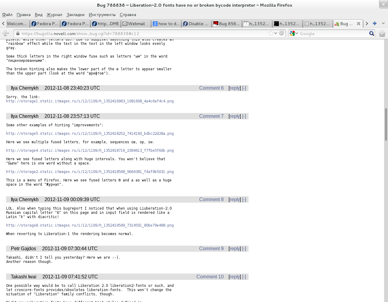
Yes, can reproduce as per your screenshot on Fedora 17. More Observation, If one check for consistency in Hinting. 1. "E-mail" : Watch "E" thickness it is not uniform with Old Liberation fonts. 2. "Passwort": See "w" is bit light than other characters. Created attachment 623366 [details] right hand side is Liberation 2.00.1 and Left hand side Liberation 1.07.2 image generated using http://pravins.fedorapeople.org/liberation/liberation-test.html Dunno what CSS used in http://kasmail.kasserver.com/index.php but attached image gives better view. Done on Fedora 17. Just uninstalled liberation and added latest version from Fedora 18 Overall the new version looks a bit thicker in bold weight and the font height seems to have increased for about 1px in the new version, too. Shapes are exactly same in fontforge file, just more better hinting i will say. And if one compare in libreoffice difference in more clear. 1. http://pravins.fedorapeople.org/liberation/text-liberation-1-07-2.png 2. http://pravins.fedorapeople.org/liberation/text-liberation-fonts-2-00-1.png Images taken in updated f18 machine. 3. http://pravins.fedorapeople.org/liberation/liberation-fonts-test.odt Difference is clear when we keep both images open same time. Are there any plans on how to continue. I still cannot see any improvement on the new Liberation 2 fonts. please join tomorrow fedora i18n meeting for further discussion on same https://fedorahosted.org/i18n/ticket/8 @Behdad Esfahbod NO. This is NOT subjective. If a vertical line falls between two pixel columns, it will be twice thicker, half-grey and rainbowed (if subpixel smoothing is used). The vertical lines should fit into pixel rows - that is the correct rendering. I encountered this problem under openSUSE after installing Liberation-2.0. This font is completely BROKEN. The Liberation-1.0 is rendered nearly ideally. You're contradictory statement is funny, as is your sense of knowing what "correct rendering" is when everyone else knows that there is no correct rendering. :) @Behdad Esfahbod Ther correct rendering is when vertical lines take integer number of pixel columns. This is what does the bytecode interpreter. This is a fact. This what the BCI was created for. It is funny how you praise a broken font. Correct (left) and incorrect(right) rendering of a vertical line: http://storage3.static.itmages.ru/i/12/1109/h_1352415548_2925841_fd02886d68.png This image includes the correct rendering (left), incorrect renderng with subpixel smoothing enabled (middle) and incorrect rendering with subpixel smoothing disabled (right) http://storage5.static.itmages.ru/i/12/1109/h_1352415869_7367569_0d447c8e3a.png Just reminded me of a cool tshirt I saw before. It said "Unless Your Name Is Google, Stop Acting Like You Know Everything!". Anyway, I'm not going to argue since that's irrelevant to getting this bug fixed. This picture shows the Liberation-1 (left) and so-called Liberation-2 (right) http://storage1.static.itmages.ru/i/12/1109/h_1352416963_1081608_4a4c6af4c4.png As you can see, in the right picture some single vertical lines take several pixels while similar lines in other letters (or other parts of the same letter like in Russian ш in the word шрифтов) occupy 1 pixel. This unevenness creates an effect of blots spread through the text. Due to subpixel smoothing this also creates an "rainbow" effect while the text in the text in the left window looks evenly gray. Some thick letters in the right window fuse such as letters "ым" in the word "лицензированными". The broken hinting also makes the lower part of the в letter to appear smaller than the upper part (look at the word "шрифтов"). Some other examples of hinting improvements: http://storage5.static.itmages.ru/i/12/1109/h_1352418252_7414160_bdbc22d28a.png Here we see multiple fused letters, for example, sequences ов, ор, ои. http://storage4.static.itmages.ru/i/12/1109/h_1352418716_2364613_f7fbe5f6db.png Here we see fused letters along with huge intervals. You won't believe that "Были" here is one word without a space. http://storage2.static.itmages.ru/i/12/1109/h_1352418568_9664381_f4af9b5031.png This is a menu of Firefox. Here we see fused letters Ф and а as well as a huge space in the word "Журнал". Those look like kerning bugs rather than hinting bugs, but it's also very broken. Ilya, you very likely use BCI for rendering Liberation 2.0, could you please try to use autohinter? The point of this bug is that the hinting bytecode is bad, forcing the autohinter kinda defeats the purpose. Understood, but do I have other option for now except add hinting instructions to the L2.0 or use autohinter for that font? Sorry, maybe I have missed something from above 65 comments. Btw. what fedora uses for rendering CrOS core fonts? Created attachment 642310 [details]
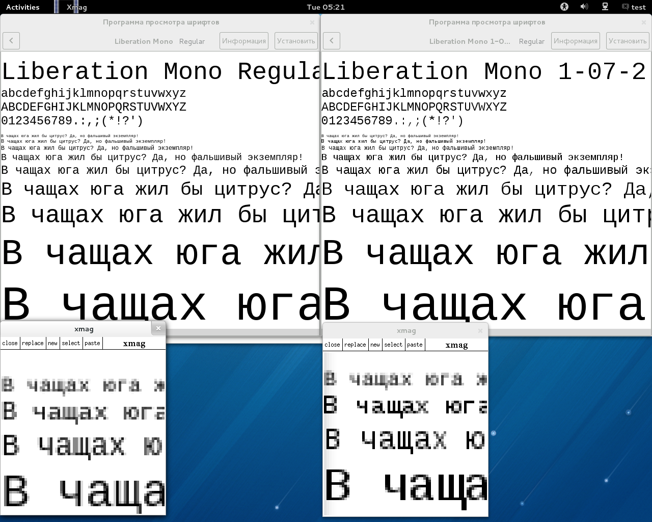
Liberation Mono 1.07 and 2.0 comparison (autohint, antialias)
I tried the autohinter with Liberation Mono 2.0: better (acceptable), but worse (fuzzier) than 1.07. (Note: both *exactly* looks the same with autohinter.)
@Pallai Roland No screenshot shows subpixel smoothing. If to enable it I expect Liberation-2.0 to look like a rainbow. 1. We all should use freetype-demos ftstring for testing hinting related bugs, that can give us more unique results. h- enable/disable glyph level hinting f- force autohint 2. As most of you know, there pluses and minuses from both side. Liberation 1.07 has 1. License issues 2. Less character coverage 3. It also has hinting related bugs Liberation 2.0 1. This bug is only issue i know. @llya can you some more screenshot for comparison using ftstring? @Pravin Satpute this bug covers several issues that may or may not be related. Overal the font is broken and unusable. One more issue is that Russian "Б" is rendered as Latin "k" with diacritic on this page (both when viewing and in the editor): https://bugzilla.novell.com/show_bug.cgi?id=788838#c12 I see the following: http://storage8.static.itmages.ru/i/12/1109/h_1352419599_7314501_80be79e488.png So the Russian word "Были" is rendered "kыли". After instelling Liberation-1.06 all is well again. This happens only on that page. (In reply to comment #72) > @Pravin Satpute this bug covers several issues that may or may not be > related. Overal the font is broken and unusable. One more issue is that > Russian "Б" is rendered as Latin "k" with diacritic on this page (both when > viewing and in the editor): > https://bugzilla.novell.com/show_bug.cgi?id=788838#c12 > > I see the following: > http://storage8.static.itmages.ru/i/12/1109/h_1352419599_7314501_80be79e488. > png > > So the Russian word "Были" is rendered "kыли". After instelling > Liberation-1.06 all is well again. This happens only on that page. that would be better filing a separate bug for that then. this is not a kinda tracker bug for Liberation fonts 2. The font is broken and unusable - that is the bug. I'm not saying that it's not a bug. but it's irrelevant to the bug being reported originally. in fact it can be fixed independently without this fix. do not mess up here. > 2. As most of you know, there pluses and minuses from both side.
>
> Liberation 1.07 has
> 1. License issues
> 2. Less character coverage
> 3. It also has hinting related bugs
>
> Liberation 2.0
> 1. This bug is only issue i know.
>
Maybe it's the only issue, but it's a regression which affects each users of the font set while the issues of Liberation 1.07 affects only a few. Maybe there are some who doesn't care, but a lot will.
IMHO there's no reason to force Liberation 2.0 in F18, should delay to F19 when all issues are sorted out..
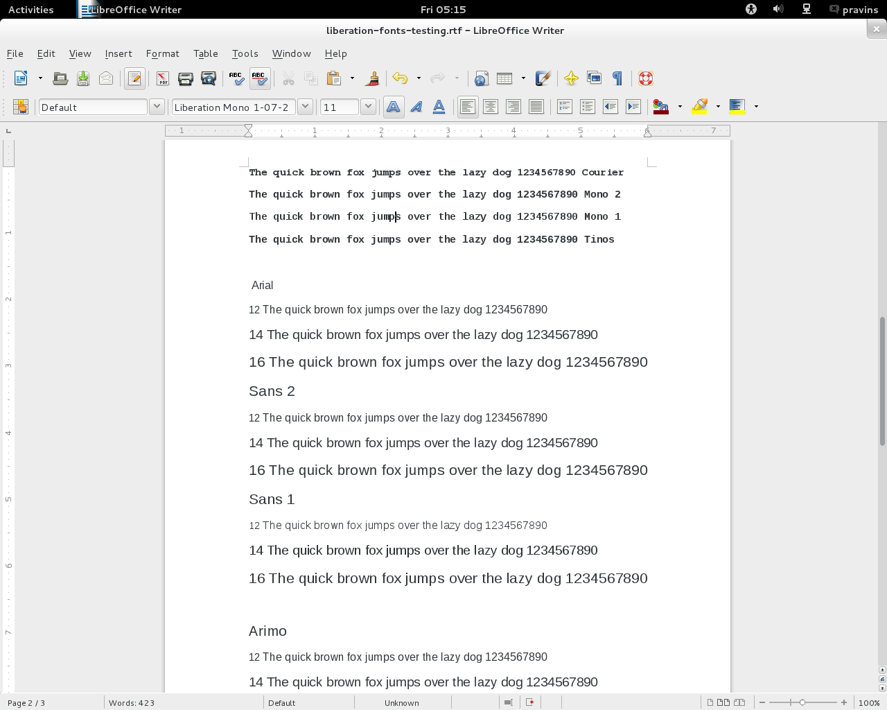
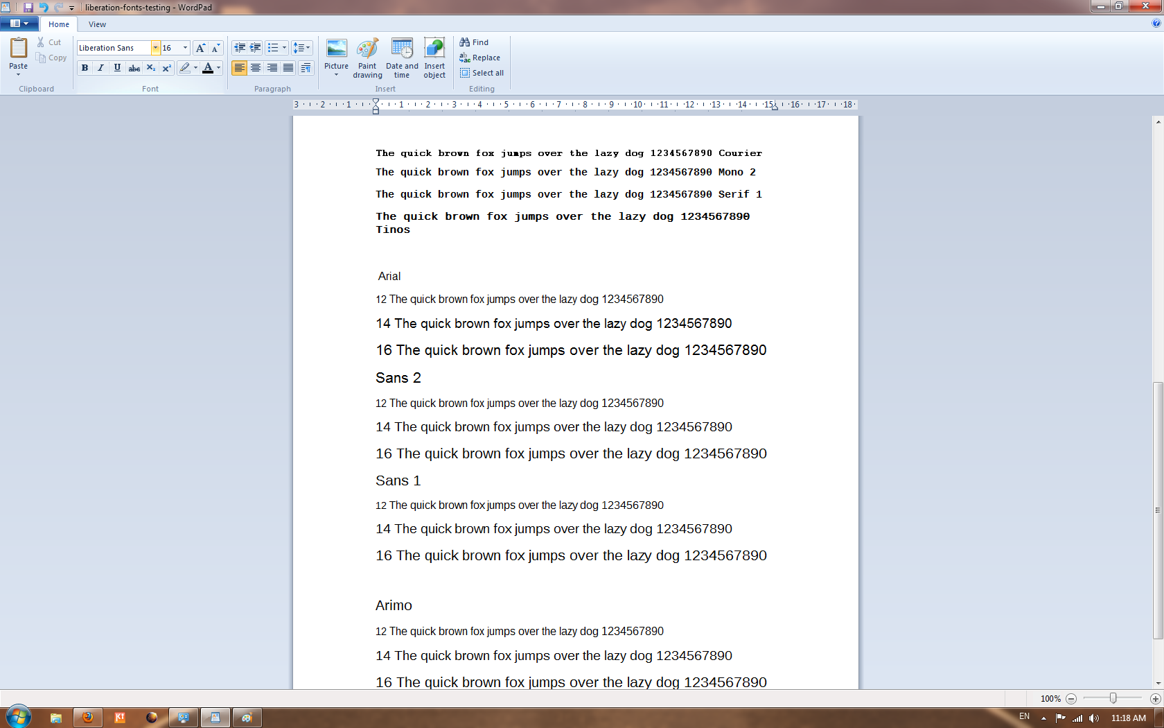
openSUSE reverted to Liberation-1.07 and Liberation-2 will be shipped as a separate package. Apologies for not providing prompt replies to some of the question raised on this bug. I was working on some other project for last couple of weeks. I am back on this issue again. Must: F18 Beta is out, so for easy comparison between old and new liberation i have created tarball with changed fontname of old liberation to "liberation sans/serif/mono 1-07-2". So we can have both fonts same time on system and easily do comparisons. Please download it from and give more feedback http://pravins.fedorapeople.org/liberation-fonts-ttf-1-07-2.tar.gz I do agree liberation 2.0 is not backward compatible w.r.t hinting (non anti-aliased and new one anti aliased) Still if majority says revert this feature, i am perfectly fine with it. We will have Fedora i18n meeting tomorrow in #fedora-meeting on irc.freenode.net at 0600 UTC. So will be helpful if some of you can join there. After that we can send mail on #fedora-devel for more audience may be (In reply to comment #63) > This picture shows the Liberation-1 (left) and so-called Liberation-2 (right) > > http://storage1.static.itmages.ru/i/12/1109/h_1352416963_1081608_4a4c6af4c4. > png > > Some thick letters in the right window fuse such as letters "ым" in the word > "лицензированными". i can reproduce this problem > > The broken hinting also makes the lower part of the в letter to appear > smaller than the upper part (look at the word "шрифтов"). Still cant reproduce this one. Can you please let me know how to reproduce. As i said earlier, please use ftstring -m "шрифтов" pt /usr/share/fonts/liberation/LiberationMono-Regular.ttf (In reply to comment #64) > Some other examples of hinting improvements: > > http://storage5.static.itmages.ru/i/12/1109/h_1352418252_7414160_bdbc22d28a. > png > > Here we see multiple fused letters, for example, sequences ов, ор, ои. > > http://storage4.static.itmages.ru/i/12/1109/h_1352418716_2364613_f7fbe5f6db. > png > > Here we see fused letters along with huge intervals. You won't believe that > "Были" here is one word without a space. > > http://storage2.static.itmages.ru/i/12/1109/h_1352418568_9664381_f4af9b5031. > png > > This is a menu of Firefox. Here we see fused letters Ф and а as well as a > huge space in the word "Журнал". 1. I cant reproduce either of these. Please write something about how to reproduce. In which locale you are testing this. I doubtful this problem happening because may be inproper mapping of lookup and script tag. 2. I see everything fine with firefox in ru_RU locale see imange: http://pravins.fedorapeople.org/firefox-with-liberation-2-0.png (check the menus, no space problem at all) - firefox-16.0.2-1.fc18.x86_64 - liberation-sans-fonts-2.00.1-1.fc18.noarch - freetype-2.4.10-2.fc18.x86_64 3. http://pravins.fedorapeople.org/liberation/ This folder has some more screenshot taken earlier with libreoffice http://pravins.fedorapeople.org/liberation/text-liberation-1-07-2.png Vs http://pravins.fedorapeople.org/liberation/text-liberation-fonts-2-00-1.png readability is more. 4. Sorry i have not done testing with Greek much. will be very useful if you can provide some more screenshot, hope so i made life bit easy with creating old liberation fonts with different fontname. > I do agree liberation 2.0 is not backward compatible w.r.t hinting (non anti-aliased and new one anti aliased)
You are wrong. On the scrinshots I poasted the both Liberation-1 and Liberation-2 are subpixel-antialiased. Existence of grayscale or subpixel anti-aliasing is not dependent on the font used. Yet with Liberation-2 we have "soap" and "rainbow".
> ftstring -m "шрифтов" pt  /usr/share/fonts/liberation/LiberationMono-Regular.ttf

Sorry, this requires much of additional work while the problem is solved for me as openSUSE restored use of Liberation-1. I am not a Fedora user.
(In reply to comment #81) > > I do agree liberation 2.0 is not backward compatible w.r.t hinting (non anti-aliased and new one anti aliased) > > You are wrong. On the scrinshots I poasted the both Liberation-1 and > Liberation-2 are subpixel-antialiased. Existence of grayscale or subpixel > anti-aliasing is not dependent on the font used. Yet with Liberation-2 we > have "soap" and "rainbow". Dont know where you noticed it. But check with grid fitting table in Liberation 1 we are not using alti-alasing for size between 8-17 Locale is LANG=ru_RU.UTF-8 LC_CTYPE="ru_RU.UTF-8" LC_NUMERIC="ru_RU.UTF-8" LC_TIME="ru_RU.UTF-8" LC_COLLATE="ru_RU.UTF-8" LC_MONETARY="ru_RU.UTF-8" LC_MESSAGES="ru_RU.UTF-8" LC_PAPER="ru_RU.UTF-8" LC_NAME="ru_RU.UTF-8" LC_ADDRESS="ru_RU.UTF-8" LC_TELEPHONE="ru_RU.UTF-8" LC_MEASUREMENT="ru_RU.UTF-8" LC_IDENTIFICATION="ru_RU.UTF-8" LC_ALL= > Dont know where you noticed it. But check with grid fitting table in Liberation 1 we are not using alti-alasing for size between 8-17
Do you mean "we=Fedora"? Anyway, if such setting exists,m it does not work: for me Liberation-1 is displayed perfectly fine with both grayscale and subpixel anti-aliasing. With subpixel one, better, of course.
(In reply to comment #85) > > Dont know where you noticed it. But check with grid fitting table in Liberation 1 we are not using alti-alasing for size between 8-17 > > Do you mean "we=Fedora"? Anyway, if such setting exists,m it does not work: > for me Liberation-1 is displayed perfectly fine with both grayscale and > subpixel anti-aliasing. With subpixel one, better, of course. No. We = "Liberation fonts users". Thanks for letting me know locale information. I did testing in that locale, you can see http://pravins.fedorapeople.org/firefox-with-liberation-2-0.png menus looks fine. > We = "Liberation fonts users".
I am a Liberation font user. I did not disable anti-aliasing for any font size ever. This is because Liberation is not suitable for non-antialiased rendering (unlike say Terminus or Wine's Tahoma).
> Thanks for letting me know locale information. I did testing in that locale, you can see http://pravins.fedorapeople.org/firefox-with-liberation-2-0.png  menus looks fine.

It is not Liberation font at any rate. For example, in Liberation, Russian "З" has the lowest line curved up at left and Russian "Ф" has the middle line penetrating the upper horizontal line and protrude.
Russian letters in Liberation-1: http://storage2.static.itmages.ru/i/12/1128/h_1354111675_2654236_f6104539ea.png Liberation-2 has the same glyphs. In the page body on your screenshot, it is possibly Liberation-1. In the menus it is definitely not Liberation. I tried same even in gedit, it works well. But anyway that is secondary issues. Major one is hinting output backward comparability, which is lacking in liberation 2.0. One more bug on same note: https://bugzilla.redhat.com/show_bug.cgi?id=881051 > I tried same even in gedit, it works well.
For me the incorrect distances between Liberation-2 characters appear only in Firefox. There is no such problem elsewhere.
I did some more testing on Windows machine, Windows7 http://pravins.fedorapeople.org/liberation/comparison-of-arial-liberation-1-and-2.png Sans is Liberation, all are giving sharp outlines. > http://pravins.fedorapeople.org/liberation/comparison-of-arial-liberation-1-and-2.png
I do not think it is good: for example, the first vertical line in "m" is thicker than the others. There is multiple "rainbow" effect. Vertical lines in "1" and in "f" are thick and reddish (f is reddish for Sans 1 and blueish for Sans 2). Arial is displayed much better.
I agree that Arial looks better though, I can see "rainbow" effects in all of them. honestly I don't see it's worth complaining so much. i.e. it's really subjective. IMHO the interesting point on this screenshot is, they are similarly rendering on Windows. though Liberation1 looks a bit smaller, the half-round at 'c' on both Liberation is wider and the bottom space at '9' is wider on Liberation 2. at any rate it looks trivial to me. that said, I don't know if the own hinting is really used on Windows. for instance, I suppose using auto-hinting on freetype may gives you similar rendering among Arial and both Liberation fonts. Well, it's really interesting but it may be not sufficient to say current fonts is good. there are still a lot of undetermined things. FWIW I want to clarify one thing I'm wondering. Ilya, you are sometimes referring OpenSuSE here, is all of results you reported here came from it and not tested on Fedora? I'm a bit concerned the build options and configuration on applications and fontconfig may be different between OpenSuSE and Fedora. it may be hard to agree with the proposed fixes. Thanks Tagoh and Ilya for observation on windows rendering. But if you notice two more things In Fedora 18 Liberation 2 looks more thick and fuzzy compare. While in Windows it looks almost close to Arial and Sans1 I did some more testing with http://pravins.fedorapeople.org/liberation/liberation-fonts-testing.rtf on Windows and Fedora 18 1a. http://pravins.fedorapeople.org/liberation/arial-sans2-sans1-arimo-testing2-windows7.png - On Windows all Arial, Sans 1 & 2 and Arimo hinted sharply. Vs 1b. http://pravins.fedorapeople.org/liberation/arial-sans2-sans1-arimo-testing2-fedora18.png - On Fedora see how output varies from Windows7, Only Sans1 produce sharpaly hinting. 2a. http://pravins.fedorapeople.org/liberation/arial-sans2-sans1-arimo-testing-fedora18.png - As we increase size, output is almost same. 2b. http://pravins.fedorapeople.org/liberation/arial-sans2-sans1-arimo-testing-windows7.png - Again here sharp hinting on Windows. So from these observation, i think font is not at the fault. whether Croscore or Liberation2, its underlying hinting mechanism which affect outputs. Liberation 1 looks good on Both platform. But same is not with Sans2 and Croscore. Created attachment 654856 [details]
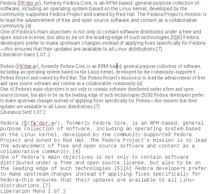
liberation-sans-1-2.png
Comparison of Liberation Sans 1 and 2 with ftview.
Left: Liberation Sans 1.07
Right: Liberation Sans 2.00
Byte code hinting used, *no* forced autohinting, grayscale anti-aliasing.
One can see that Liberation Sans 1 is very sharply rendered up to 17 point.
The vertical and horizontal lines are exactly one pixel wide and black,
there is not gray around them. From 18 point on, the vertical lines jump
to a width of 2 pixels.
For Liberation Sans 2, there is always some gray around the stems which
makes it much more fuzzy and at sizes <= 17 point it makes it also look
much bolder.
A sharp byte code rendering as for Liberation Sans 1 of course causes
sudden jumps in boldness when increasing the font size because the
vertical lines have a thickness of integer pixels, at some point it
jumps from a width of 1 pixel to a width of 2 pixels.
Without such bytecode, no such sudden jump in boldness appears when
increasing the font size.
> I agree that Arial looks better though, I can see "rainbow" effects in all of them.

Indeed, the all three look worse in Windows than Liberation-1 on Linux where there is no "rainbow" effect at all.
> is all of results you reported here came from it and not tested on Fedora?

Yes.
> http://pravins.fedorapeople.org/liberation/arial-sans2-sans1-arimo-testing2-fedora18.png - On Fedora see how output varies from Windows7, Only Sans1 produce sharpaly hinting.

Why do you test without subpixel smoothing on Linux? Your windows screenshots use subpixel, you have to enable it on Linux to comare. Also when you enable t the hinting glitches would be more evident.
(In reply to comment #98) > > I agree that Arial looks better though, I can see "rainbow" effects in all of them. > > Indeed, the all three look worse in Windows than Liberation-1 on Linux where > there is no "rainbow" effect at all. In the screenshots from Windows, the sharp byte code rendering which can be seen in my ftview screenshots in comment#97 seems to be never used. I personally like that sharp hinting better, but it really seems to be a subjective thing and the general trend seems move away from that sharp type of hinting where vertical and horizontal lines are exactly one pixel wide at small sizes. Newer fonts don't seem to have such byte code anymore. No, the only problem with Windows Arial rendering is that it has vertical lines slightly thicker than 1 pixel. Otherwise the hinting is sharp and exact. (In reply to comment #100) > > http://pravins.fedorapeople.org/liberation/arial-sans2-sans1-arimo-testing2-fedora18.png - On Fedora see how output varies from Windows7, Only Sans1 produce sharpaly hinting. > > Why do you test without subpixel smoothing on Linux? Your windows > screenshots use subpixel, you have to enable it on Linux to comare. Also > when you enable t the hinting glitches would be more evident. just a quote from the freetype.spec: # Patented subpixel rendering disabled by default. This is the reason why we don't use it. FWIW I see OpenSuSE enables autohinting on their liberation2 package. if you don't like the blurred rendering so much, try to disable it anyway. > Patented subpixel rendering disabled by default.
Maybe but the users enable it so one has to care that the fonts look OK with subpixel enabled.
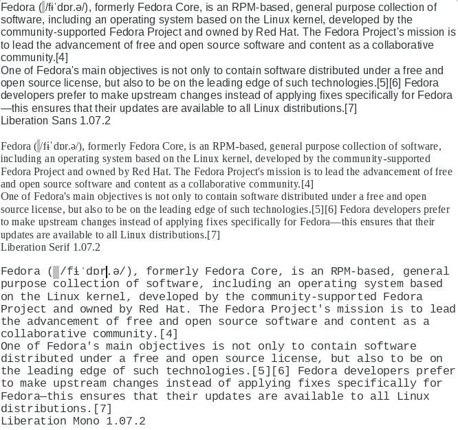
Agree on the fact that subpixel rendering gives better results. 1. http://pravins.fedorapeople.org/liberation/arial-sans2-sans1-arimo-testing2-fedora18-subpixel.png (with subpixel) http://pravins.fedorapeople.org/liberation/arial-sans2-sans1-arimo-testing2-fedora18.png (without subpixel) But still http://pravins.fedorapeople.org/liberation/arial-sans2-sans1-arimo-testing2-windows7.png Output is better than Fedora. Sans2 looks more thick and fuzzy in Fedora compare to Windows. Windows results made me think twice. It works well there. Almost near to Sans1 and Arial. Created attachment 654949 [details] liberation-sans-1-2-fontforge-grid-fit-view.png Using "Grid Fit View" as explained here http://fontforge.org/charview.html shows that the byte code hinting in Liberation Sans 1 and 2 is very different. Left: Liberation Sans 1 Right: Liberation Sans 2 This screenshot shows the effect of the byte code "bending" outlines to make it fit to the grid. For Liberation Sans 1, this is done much more precisely and extrem as for Liberation Sans 2. For Liberation Sans 1, after the grid fitting, the "hole" in the 'g' has become narrower but both the left and the right vertical part of the "circle" align very exactly with vertical columns of pixels. therefore one has thin vertical lines which are very black. For Liberation Sans 2, the alignment to the grid is less precise, for example the vertical part of the "circle" on the left still ends up on the border of two vertical columns, so both columns get some grey ink, making this vertical line appear wider. > 1. http://pravins.fedorapeople.org/liberation/arial-sans2-sans1-arimo-testing2-fedora18-subpixel.png (with subpixel)
No. There is NO subpixel smoothing on this screenshot!
Right, that's all grayscale. You need to install freetype-freeworld (from RPM Fusion Free) to get working subpixel smoothing on Fedora. And I wonder whether the hinting in CrosCore / Liberation 2 is the result of running ttfautohint or some other low-quality automated process. @Kevin yes, sorry i forgot to install freetype-freeworld package. [pravins@dhcp201-206 ~]$ xrdb -query Xft.antialias: 1 Xft.dpi: 96 Xft.hinting: 1 Xft.hintstyle: hintslight Xft.lcdfilter: lcddefault Xft.rgba: rgb I am getting better results. pravins.fedorapeople.org/liberation/arial-sans2-sans1-arimo-testing2-fedora18-subpixel-rendering.png We need this setting for Liberation2 This blog is very useful http://blog.andreas-haerter.com/2011/07/18/tune-improve-fedora-fonts-typeface-ubuntu-like-sharp-fonts You should set hintfull to get normal result with Liberation. Without hinbtfull and with subpixel you'll get rainbow. (In reply to comment #107) > Created attachment 654949 [details] > liberation-sans-1-2-fontforge-grid-fit-view.png Yes and that is output we are getting in Fedora with bytecode interpreter Created attachment 656570 [details] liberation-sans-1-autohint=false-different-hintstyles.png This shows rendering for Liberation Sans 1.07 using rgba=rgb hinting=true autohint=false always and compares the results for hintstyle={hintfull,hintmedium,hintslight,hintnone} As you can see in the screenshots, hintfull uses the byte code interpreter for sharp rendering. The results for hintmedium, hintslight, and hintnone are all identical, all fuzzy. Using anything else but "hintfull" seems to disable hinting completely when autohint=false. The byte code hinting does not have different hintstyles, it is either on or off. So only hintfull really makes sense together with autohint=false. With autohint=true, the hintstyle option has an influence, i.e. the hintstyle option makes sense only when using the autohinter. But of course with the autohinter, one can never get the extremely sharp rendering one can get with liberation sans 1.07 and the byte code interpreter. Comment#111, Ilya> You should set hintfull to get normal result with Liberation. Yes, if you want to use the very good byte code in liberation 1.07, you should set hintstyle=hintfull. Comment#112, Ilya> Without hinbtfull and with subpixel you'll get rainbow. My screenshots above use subpixel rendering. So the leftmost screenshot, which uses hintstyle=hintfull, autohint=false, shows some colour fringes. But only a little bit, it is much sharper then the other 3 screenshots for hintstyle={hintmedium,hintslight,hintnone}. I prefer rgba=none hinting=true autohint=false hintstyle=hintfull for liberation sans 1.07, i.e. without even the slight color fringes. So I seem to prefer the same rendering Ilya prefers. Created attachment 656594 [details] liberation-sans-1-autohint=false-different-hintstyles-rgba=none.png Similar to the screenshots in comment#114,only without subpixel rendering. This shows rendering for Liberation Sans 1.07 using rgba=none hinting=true autohint=false always and compares the results for hintstyle={hintfull,hintmedium,hintslight,hintnone} hintfull uses the byte code interpreter for sharp rendering. The results for hintmedium, hintslight, and hintnone are all identical, all fuzzy. looking at Mike screenshot, it is clean that hintfull makes sense when you have sharp bytecode. Which is not case with the Liberation2. Created attachment 656618 [details]
liberation-sans-2-autohint=false-different-hintstyles-rgba=rgb.png
Now a similar screenshot with Liberation 2.00.
rgba=rgb
hinting=true
autohint=false <- i.e. using the byte code
always and then the results for
hintstyle={hintfull,hintmedium,hintslight,hintnone}
are compared.
hintmedium and hintslight give identical results.
hintnone is slightly fuzzier.
hintfull is slightly sharper.
But the differences are small, *all* of them are quite fuzzy.
Hintfull cannot render as sharp as for liberation 1.07 because
liberation 2.00 apparently doesn’t have such a high quality byte
code.
Created attachment 656619 [details] liberation-sans-2-autohint=true-different-hintstyles-rgba=rgb.png And one more screenshot using Liberatin 2.00 using the autohinter. rgba=rgb hinting=true autohint=true <- i.e. *not* using the byte code always and then the results for hintstyle={hintfull,hintmedium,hintslight,hintnone} are compared. hintmedium and hintslight give identical results. hintnone is slightly fuzzier. hintfull is slightly sharper. But the differences are small, *all* of them are quite fuzzy. => using the autohinter, liberation sans 2.00 also never renders as sharp as liberation 1.07 with the bytecode interpreter and hintfull. No matter what settings are used for liberation sans 2.00, it will always render much fuzzier then liberation 1.07. comment#109, Kevin Kofler> And I wonder whether the hinting in comment#109, Kevin Kofler> CrosCore / Liberation 2 is the result of comment#109, Kevin Kofler> running ttfautohint or some other comment#109, Kevin Kofler> low-quality automated process. I also think this has likely been done by some automated process, I think byte code for very sharp rendering as in liberation 1.07 cannot be done automatically, it is a tedious manual process. (In reply to comment #110) > @Kevin yes, sorry i forgot to install freetype-freeworld package. > > [pravins@dhcp201-206 ~]$ xrdb -query > Xft.antialias: 1 > Xft.dpi: 96 > Xft.hinting: 1 > Xft.hintstyle: hintslight > Xft.lcdfilter: lcddefault > Xft.rgba: rgb > > I am getting better results. I cannot see much differences between the different settings for liberation sans. No matter which settings are used, it never renders as sharp as liberation 1.07 with autohint=false and hintstyle=hintfull. > pravins.fedorapeople.org/liberation/arial-sans2-sans1-arimo-testing2- > fedora18-subpixel-rendering.png > > We need this setting for Liberation2 > This blog is very useful > http://blog.andreas-haerter.com/2011/07/18/tune-improve-fedora-fonts- > typeface-ubuntu-like-sharp-fonts I don’t know why this guy thinks these settings make it sharper. Certainly the hintslight he suggests doesn’t make it any sharper than hintfull. And for Liberation2, the differences between these settings are minor anyway. (In reply to comment #119) > > I cannot see much differences between the different settings for > liberation sans. Due to hintlight it does not use bytecode to its full strength and use subpixel rendering. I think that is the reason when we use above setting http://pravins.fedorapeople.org/liberation/arial-sans2-sans1-arimo-testing2-fedora18-subpixel-rendering.png All renders bit similar to each other. Since the outline is same in fonts for all fonts (not tested Arail though) > > No matter which settings are used, it never renders as sharp > as liberation 1.07 with autohint=false and hintstyle=hintfull. Agree with this, below is image for it. Just compare it with above. http://pravins.fedorapeople.org/liberation/arial-sans2-sans1-arimo-testing2-fedora18.png I have sent mail on fonts@, test@ and i18n@ for more input, lets see > Due to hintlight it does not use bytecode to its full strength and use subpixel rendering. I think that is the reason when we use above setting
No, you can use both hintlight and hintfull with subpixel rendering. When you use hintlight, with subpixel, you get the rainbow effect. With hintfull you get excellent appearance.
Who told you that you cannot use hintfull with supbixel?
(In reply to comment #120) > (In reply to comment #119) > > > > I cannot see much differences between the different settings for > > liberation sans. > > Due to hintlight it does not use bytecode to its full strength and use > subpixel rendering. I think that is the reason when we use above setting > > http://pravins.fedorapeople.org/liberation/arial-sans2-sans1-arimo-testing2- > fedora18-subpixel-rendering.png All renders bit similar to each other. > Since the outline is same in fonts for all fonts (not tested Arail though) Yes, here all 3 fonts (Arial, Liberation Sans 1, Liberation Sans 2) look very similar because the byte code hinting is not used. All very fuzzy. > > No matter which settings are used, it never renders as sharp > > as liberation 1.07 with autohint=false and hintstyle=hintfull. > > Agree with this, below is image for it. Just compare it with above. > > http://pravins.fedorapeople.org/liberation/arial-sans2-sans1-arimo-testing2- > fedora18.png And here Arial and Liberation Sans 1 are very sharp, because the byte code is used and these have high quality byte code. Liberation Sans 2 sticks out here as much bolder and fuzzier because it does not have such high quality byte code. The results for using the byte code of Liberation Sans 2 are similar to using the autohinter which makes it likely that some automatic tool was used to generate the byte code for Liberation Sans 2 and that tool achieves similar results as the autohinter of freetype. (In reply to comment #121) > > Due to hintlight it does not use bytecode to its full strength and use subpixel rendering. I think that is the reason when we use above setting > > No, you can use both hintlight and hintfull with subpixel rendering. Yes. > When you use hintlight, with subpixel, you get the rainbow > effect. With hintfull you get excellent appearance. With hintfull, there is also a little “rainbow effect” when subpixel hinting is used. See my screenshot in comment#114, left side. Of course it is much less obvious then with the other options (hintmedium, hintslight, hintnone). But is still visible. For me, even this little bit of colours is too much already, I prefer the result in the screenshot in comment#115 on the left, i.e. sharp byte code hinting without subpixel hinting, only gray-scale. (In reply to comment #116) > looking at Mike screenshot, it is clean that hintfull makes sense when you > have sharp bytecode. Which is not case with the Liberation2. Yes, hintstyle=hintfull and autohint=false gives much sharper rendering for Liberation 1 but it has very little effect on Liberation 2. For me the differences in Liberation 2 between the byte code interpreter, the autohinter, and the hintstyle options are insignificant. There are some differences, but very tiny. Only the sharp byte code in Liberation 1 makes a big difference to me. Hello guys. You are all super-smart and I know zero about fonts, so I can't really join the conversation. But I was plagued by the horrible fonts since I upgraded to Fedora 18 Beta and found this bugzilla yesterday after quite some effort. See screenshots below, this is how it looks for me. Everything is taken with Hinting:Full and Antialiasing:Rgba set it gnome-tweak-tool, because those settings give the best output to me. The web page is twice enlarged with Ctrl++, because that's the way I usually read it. Fedora 17 default: http://i.imgur.com/4GSAJ.png Perfect fonts, very clear, crisp and readable. Fedora 18 default: http://i.imgur.com/MLU9N.png Very blurry fonts, hardly readable for a longer period. My eyes bleed. After seeing this I wanted to switch the OS, but I decided to search for the source of the problem instead and arrived here. Fedora 18 with freetype-freeworld: http://i.imgur.com/TuGWA.png A bit better than the default, but I still see rainbows in the text, which makes me subconsciously annoyed. I very much prefer Fedora 17 way of rendering. If there is any way of switching to it, I'll do it, no matter the effort. But I hope it won't be needed and blurry fonts won't be the default. I don't really care that the fonts scale better (there is no big jump between 13pt and 14pt) or whatnot, because that's not important to me. The purpose of the font is to be nicely readable. That's all I want and expect. Fedora 17 is much better in this regard. > Of course it is much less obvious then with the other options > (hintmedium, hintslight, hintnone). But is still visible. > > For me, even this little bit of colours is too much already, I prefer > the result in the screenshot in comment#115 on the left, i.e. sharp > byte code hinting without subpixel hinting, only gray-scale. Do you notice any colouring in this screenshot (left side)?: http://storage1.static.itmages.ru/i/12/1109/h_1352416963_1081608_4a4c6af4c4.png
> I very much prefer Fedora 17 way of rendering. If there is any way of
> switching to it, I'll do it, no matter the effort. But I hope it won't be
> needed and blurry fonts won't be the default. I don't really care that the
> fonts scale better (there is no big jump between 13pt and 14pt) or whatnot,
> because that's not important to me. The purpose of the font is to be nicely
> readable. That's all I want and expect. Fedora 17 is much better in this
> regard.

Install package with Liberation fonts from Fedora-17.
(In reply to comment #126) > > > Of course it is much less obvious then with the other options > > (hintmedium, hintslight, hintnone). But is still visible. > > > > For me, even this little bit of colours is too much already, I prefer > > the result in the screenshot in comment#115 on the left, i.e. sharp > > byte code hinting without subpixel hinting, only gray-scale. > > Do you notice any colouring in this screenshot (left side)?: > > http://storage1.static.itmages.ru/i/12/1109/h_1352416963_1081608_4a4c6af4c4. > png yes. It is obvious when you magnify it with some tool, but I see it even with the naked eye from 1 metre distance form the monitor. Of course it is more extreme on the right side but it is visible on the left side as well. Created attachment 656902 [details] fedora-18-firefox-liberation-2-1-comparision.png comment#125 Kamil> I very much prefer Fedora 17 way of rendering. If comment#125 Kamil> there is any way of switching to it, I'll do it, no comment#125 Kamil> matter the effort. But I hope it won't be needed comment#125 Kamil> and blurry fonts won't be the default. I don't comment#125 Kamil> really care that the fonts scale better (there is comment#125 Kamil> no big jump between 13pt and 14pt) or whatnot, comment#125 Kamil> because that's not important to me. The purpose of comment#125 Kamil> the font is to be nicely readable. That's all I comment#125 Kamil> want and expect. Fedora 17 is much better in this comment#125 Kamil> regard. comment#127 Ilya> Install package with Liberation fonts from Fedora-17. This screenshot shows a comparison how fedora 18 firefox font rendering changes when installing the liberation fonts 1.07. Left side: Fedora 18 default, Liberation fonts 2.00, similar to Kevins screenshot. Right side: Liberation fonts 2.00 removed and Liberation fonts 1.07 installed instead, no other changes. The right side shows the very sharp byte code rendering which cannot be achieved with Liberation fonts 2.00, no matter what settings are used. Kevin and Ilya prefer this very much. I prefer it as well. But it seems to be a matter of taste. And the trend seems to go to fuzzier rendering, many new fonts do not have such high-quality byte code anymore. some more screenshots for cyrillic script 1. http://pravins.fedorapeople.org/liberation/comparing-liberation-mono-cyrillic-.png 2. http://pravins.fedorapeople.org/liberation/comparing-liberation-sans-cyrillic.png 3. http://pravins.fedorapeople.org/liberation/comparing-liberation-serif-cyrillic.png
> yes.
>
> It is obvious when you magnify it with some tool, but I see it even with the
> naked eye from 1 metre distance form the monitor.

Oh magnifying with a tool does not count of course, because magnifyed obect cannot employ the subpixel effect.
(In reply to comment #131) > > yes. > > > > It is obvious when you magnify it with some tool, but I see it even with the > > naked eye from 1 metre distance form the monitor. > > Oh magnifying with a tool does not count of course, because magnifyed obect > cannot employ the subpixel effect. Of course, therefore I took care to mention that I can see it with the naked eye from 1 metre distance from my monitor. But the magnifying clearly shows that subpixel hinting has been used and what colours have been used. I prefer sharp byte code hinting with gray-scale antialiasing. I just used "DejaVu Sans Mono" with autohint=false, hintstyle=hintfull and rgba=rgb in my terminal for a while, I don’t like it, I clearly see the colour fringes, it quickly annoys me. I really prefer gray-scale anti-aliasing, at least with the current implementation of subpixel hinting in freetype 2.4.8. Maybe the new implementation is better, I did not yet test it. But these things really seem to depend on user preference, it is hard to say what is "best" here. Here is an interesting site explaining a lot of details about “hinting”: http://www.rastertragedy.com/ It also makes use of magnifying tools to explain what happens. This change is caused by the GASP table settings.
Using TTX, here is Liberation Sans Bold 1:
<gasp>
<gaspRange rangeMaxPPEM="8" rangeGaspBehavior="2"/>
<gaspRange rangeMaxPPEM="10" rangeGaspBehavior="1"/>
<gaspRange rangeMaxPPEM="65535" rangeGaspBehavior="3"/>
</gasp>
Here is Liberation Sans Bold 2:
<gasp>
<gaspRange rangeMaxPPEM="8" rangeGaspBehavior="2"/>
<gaspRange rangeMaxPPEM="10" rangeGaspBehavior="3"/>
<gaspRange rangeMaxPPEM="65535" rangeGaspBehavior="3"/>
</gasp>
Spot the change in the rangeGaspBehavior :)
As far as I know, we ignore gasp table on Linux. I think Firefox respects it, but definitely not GNOME. Yeah, i did not found any difference even after changing values in Gasp table. This is to update all. It is decided to defer Liberation 2.0 from Fedora 18. https://fedorahosted.org/i18n/ticket/8 I will soon build Liberation 1 for Fedora 18 with Epoc. *** Bug 881051 has been marked as a duplicate of this bug. *** liberation-fonts-1.07.2-11.fc18 has been submitted as an update for Fedora 18. https://admin.fedoraproject.org/updates/liberation-fonts-1.07.2-11.fc18 Package liberation-fonts-1.07.2-11.fc18: * should fix your issue, * was pushed to the Fedora 18 testing repository, * should be available at your local mirror within two days. Update it with: # su -c 'yum update --enablerepo=updates-testing liberation-fonts-1.07.2-11.fc18' as soon as you are able to. Please go to the following url: https://admin.fedoraproject.org/updates/FEDORA-2012-19949/liberation-fonts-1.07.2-11.fc18 then log in and leave karma (feedback). liberation-fonts-1.07.2-12.fc18 has been submitted as an update for Fedora 18. https://admin.fedoraproject.org/updates/liberation-fonts-1.07.2-12.fc18 liberation-fonts-1.07.2-12.fc18 seems to be good - if people here could download and test it that would be much appreciated. liberation-fonts-1.07.2-12.fc18 has been pushed to the Fedora 18 stable repository. If problems still persist, please make note of it in this bug report. |